Overview
Teams often oversize images because they want to be safe. The result is heavy pages, inconsistent crops, and endless last-minute resizing. Others go too small and end up with soft banners, pixelated blog headers, or storefront thumbnails that make products look cheap.
The useful goal is not one universal size. The useful goal is a sizing system that matches the destination, leaves a bit of room for high-density screens, and stays simple enough that everyone on the team can follow it.
Practical sizing notes
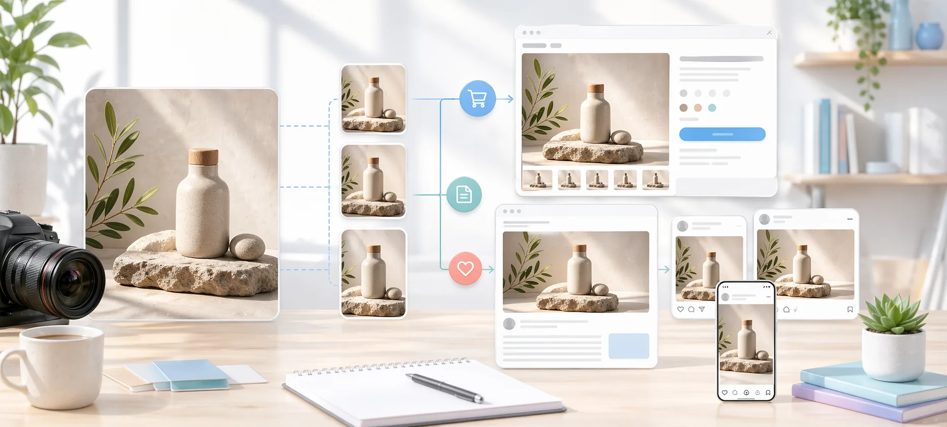
Image size decisions become easier when you separate composition from export dimensions. The composition decides what should be visible; the export size decides how the file behaves in a specific layout or channel.
For webshops, consistency matters more than chasing one universal size. Product grids look cleaner when every item follows the same crop logic, while product pages can allow more generous detail images for customers who want to inspect material and shape.
Blogs and social previews are less forgiving than they look. A hero image that works beautifully on a desktop article can crop awkwardly in a social card, so important text and product details should stay away from the outer edges.
Sizing review checklist
- Test the image in its real container on desktop and mobile.
- Keep important subject matter inside the safe middle area.
- Use consistent aspect ratios for repeated product or article cards.
- Avoid uploading very large originals when the page only displays a small image.
Who this is for
- Merchants preparing product photos for collection and product-detail pages.
- Writers and marketers publishing featured images for articles and landing pages.
- Teams exporting social visuals in several aspect ratios from the same source set.
Step-by-step guidance
Step 1
Define one standard size for each recurring destination
Create one approved size for collection thumbnails, one for product detail, one for blog hero images, and one per major social aspect ratio. The point is to reduce improvisation. If your team has a shared default, you stop getting random dimensions from every contributor.
Step 2
Keep storefront images large enough for zoom and modern screens
Product-detail images usually need more resolution than social images because shoppers inspect texture, stitching, materials, or packaging. Collection tiles can be smaller and more standardized. In practice, many shops benefit from one square export for catalog use and one larger detail image for closer viewing.
Step 3
Use wide, clean hero images for blogs and landing pages
Article headers and landing heroes usually need a landscape-friendly aspect ratio that crops predictably across desktop and mobile breakpoints. A wide export works best when the focal point is centered or compositionally safe. If text overlays will be added later, leave visual breathing room.
Step 4
Export social media from purpose-built aspect ratios
Do not rely on one landscape image to serve every social network. Square, portrait, and story-style formats frame content differently. Use separate exports when the platform context changes so the main subject stays readable and balanced.
Step 5
Pair size decisions with file-weight discipline
Good dimensions do not help if the file is still unnecessarily heavy. Once a destination size is defined, choose an output format and compression approach that keeps the visual quality acceptable without bloating the page or upload time.
A practical export set
A small ecommerce team might keep square product-card exports, wider product-detail exports, and separate social-card exports. Those three outputs cover most daily publishing without forcing every image into one compromise.
When the same source image needs to serve several contexts, create the most important crop first. Then export secondary versions from that approved composition, so the brand look stays consistent across shop, blog, and campaign surfaces.
Comparison or example section
Webshop images are about consistency and buyer confidence. Blog images are about layout clarity and readability. Social images are about framing and speed of consumption. Treating them as separate destinations makes your sizing choices much easier.
A team that keeps three or four approved export targets usually works faster than a team that keeps one giant “master” image and improvises at publish time.
Mistakes to avoid
- Using the same export size for storefront tiles, blog headers, and social posts.
- Uploading oversized product images that slow the page without adding visible value.
- Cropping social graphics from a landscape image that was never composed for portrait use.
- Ignoring focal point safety when banners will be viewed on mobile.
Learning hub
Build a cleaner image workflow around the converter
The converter is strongest when it is used as part of a repeatable publishing workflow, not as a random last-minute export step.
Best for
- Webshops that need fast, consistent catalog exports.
- Creators preparing one source set for multiple channels.
- Teams that want format and dimension decisions to feel less ad hoc.
How to use it well
What the converter is best for: Use it when the main problem is speed and consistency: resizing large sets, changing output format, preparing square product images, or exporting platform-specific variants from the same source files.
When PNG, JPG, and WebP should change your workflow: Format choice should follow the destination. Product photos often want JPG or WebP, while transparency-heavy assets need PNG. A converter becomes more useful when the team follows simple rules instead of guessing per file.
Why previewing a small sample matters: Batch conversion is fast enough that people often skip sample review. That is exactly how quality mistakes spread through a whole export run. Review five images before you run the full batch.
Common troubleshooting signals: If the output looks soft, the source may already be too small. If backgrounds feel wrong, the forced ratio or background treatment probably needs changing. If files are still heavy, the issue is often format choice rather than dimensions alone.
FAQ
Do I need different sizes for every channel?
Not every minor channel, but you should define different export targets for your core storefront, blog, and major social layouts.
What matters more: dimensions or file size?
Both matter. Good dimensions create a strong layout fit, while sensible file weight protects load speed and usability.
Should my collection and product-detail images be the same size?
Usually not. Collection views benefit from consistent, efficient sizing, while product-detail pages often need a larger image for inspection.