Overview
Before-and-after claims are easy to make and hard to judge honestly. Teams often publish an “improved” image because it looks more dramatic, not because it is easier to understand. Strong product imagery should help shoppers read the product faster and feel confident in what they see.
A simple checklist protects you from editing for effect instead of clarity. It creates one shared standard for deciding whether a change actually makes the image more useful.
Practical before-and-after notes
A before-and-after review works best when it answers a business question: will this image make the product easier to understand and more trustworthy? Pretty edits are not automatically better edits.
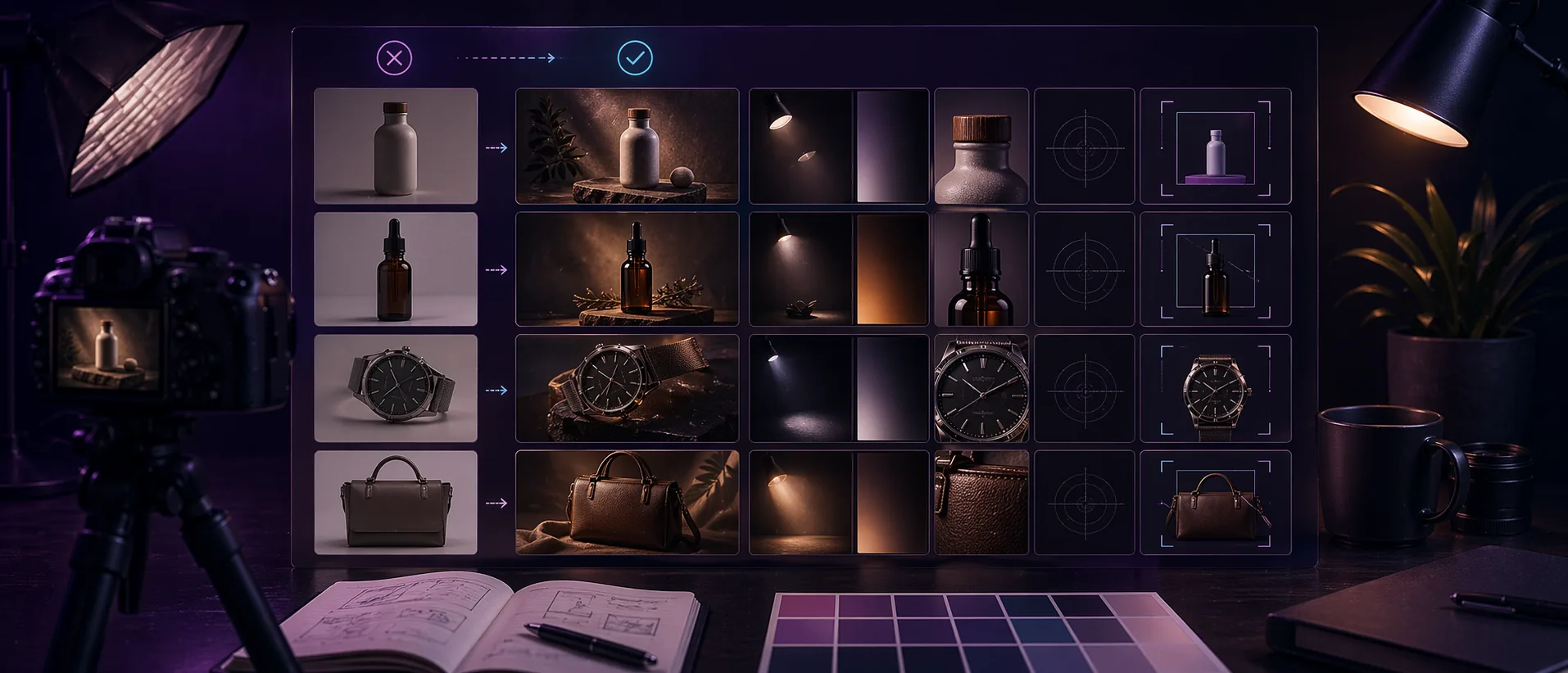
Reviewing product photos as a set is just as important as reviewing one image. A single polished image can look great, but a collection page needs consistency across background, crop, contrast, and perceived lighting quality.
Keep a short record of the edit choices that worked. If a certain light angle, crop ratio, or export format consistently improves one product line, that becomes a repeatable standard instead of a one-off improvement.
Before approving the edited image
- Check whether the product color still feels honest.
- Make sure important product details are not hidden by shadow or crop.
- Compare the edited image with at least two other product images from the same collection.
- Confirm the file loads quickly enough for the page where it will be used.
Who this is for
- Ecommerce teams reviewing product photo edits before upload.
- Creators comparing raw images with relit or cleaned variants.
- Anyone who wants a repeatable quality gate instead of taste-based guesswork.
Step-by-step guidance
Step 1
Check the subject readability first
The product should feel easier to understand after the edit. Edges, materials, labels, and overall shape should become clearer, not busier. If the eye struggles more after the change, the edit probably moved in the wrong direction.
Step 2
Check whether the edit preserved believable color and material
Shoppers rely on product images to judge finish, fabric, packaging, and tone. If the after image adds mood at the cost of honesty, it may look stylish but hurt confidence. The best improvement retains the product truth while improving visibility.
Step 3
Check whether depth improved without creating gimmicks
Depth should help the product separate from the background. It should not create halos, odd glow zones, or lighting behavior that feels fake. Strong after images feel cleaner, not louder.
Step 4
Check the edit in its final context
Compare the before and after inside a product card, collection page, or hero slot. Some changes that seem subtle at full size are exactly right in layout. Other changes that feel impressive in isolation become distracting once surrounded by other product imagery.
A simple review pass
Place the original and edited image beside the product title, price, and a neighboring product card. That context exposes issues that are easy to miss inside an editing tool, especially overdone contrast or a crop that feels too tight.
If the edited version improves clarity without calling attention to the edit itself, approve it and reuse the same review method for the next product batch. Consistency is what makes the whole store feel more polished.
Comparison or example section
A good before-and-after comparison answers one question: does the after image make the product easier to scan and easier to understand? If the answer is yes, the edit is likely working. If the answer is only “it looks more dramatic,” the result is less reliable.
Mistakes to avoid
- Judging the edit on style alone.
- Ignoring whether the product color still feels accurate.
- Reviewing only the full-size canvas and not the live layout context.
- Treating stronger contrast as automatic improvement.
Learning hub
Use relighting to improve clarity, not just drama
Re-Light Studio works best when the source image is already decent and only needs better focus, depth, or polish.
Best for
- Product images that look flat or underlit.
- Campaign visuals that need a cleaner focal point.
- Teams improving existing images instead of reshooting everything.
How to use it well
Where browser relighting helps most: It is most effective on clean product photos, mockups, and controlled visuals where subtle light direction can improve readability and depth without changing the truth of the product.
What good relighting should look like: The result should feel cleaner and more premium, not obviously edited. Strong relighting guides the eye. Weak relighting leaves the image flat. Overdone relighting makes the product feel less believable.
Limitations you should respect: Relighting cannot repair blur, broken composition, or a badly exposed source file. It should improve an already usable image, not pretend a flawed source is production-ready.
How to review before-and-after honestly: Check whether the product is easier to understand, whether the material still looks believable, and whether the result still feels grounded in reality when viewed inside a real page layout.
FAQ
What is the fastest way to compare before and after versions?
Toggle between versions at both full size and realistic product-card size. That reveals whether the change improves clarity or only adds visual drama.
Should every product image be relit?
No. If the original image is already clean, consistent, and readable, a relight pass may add little value.
What is the strongest sign that an edit is too heavy?
When the edited version no longer feels like the same real product, the treatment has gone too far.